GETTING A SCRIPT TATTOO? HERE'S WHAT TO THINK ABOUT
GETTING A SCRIPT TATTOO? HERE'S WHAT TO THINK ABOUT
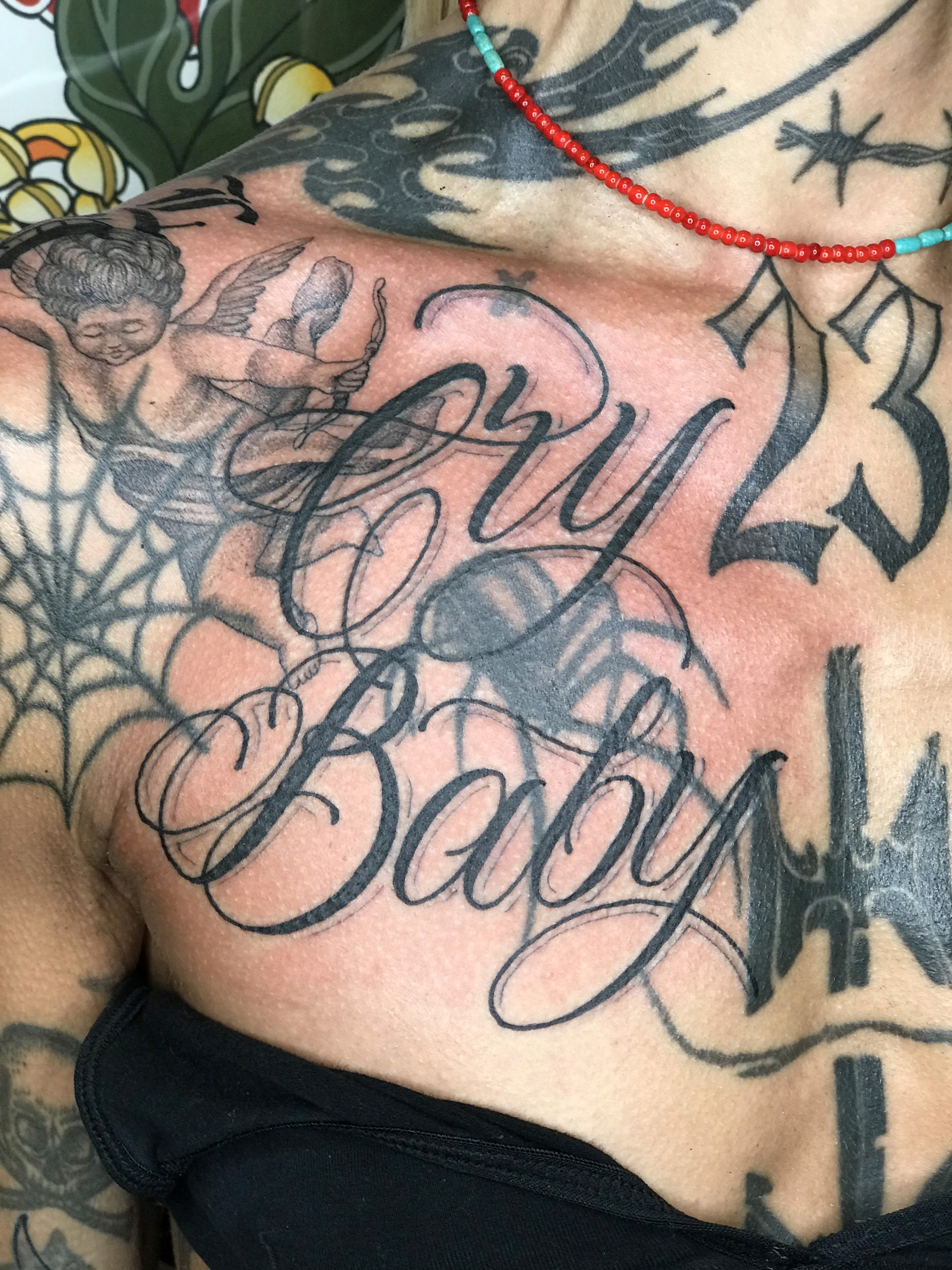
Script is another of my favourite things to tattoo, but it's also one of the things people put the least thought into before they come in. It's "just writing", right? Not quite. Good lettering takes a lot more than typing a word out in a nice font, and a few simple things make a massive difference to how it looks, both on the day and years down the line.
Size matters more than you think
This is the big one. Lettering that's too small or too tightly packed will blur over time as the ink settles under the skin. The gaps inside letters like "e" and "a" start to close up, and before long it's hard to read. Going a bit bigger than you first thought gives the letters room to breathe, and it'll still be readable in years to come. always listen to your artist as they will have the most knowledge as to what will work. Obviously I am always happy to try smaller to see if it can work. But at the same time if the chosen font isn't going to work small then it isn't going to work and we would discuss changing something to make it not only work but be similar and how you envisioned it.
Placement and flow
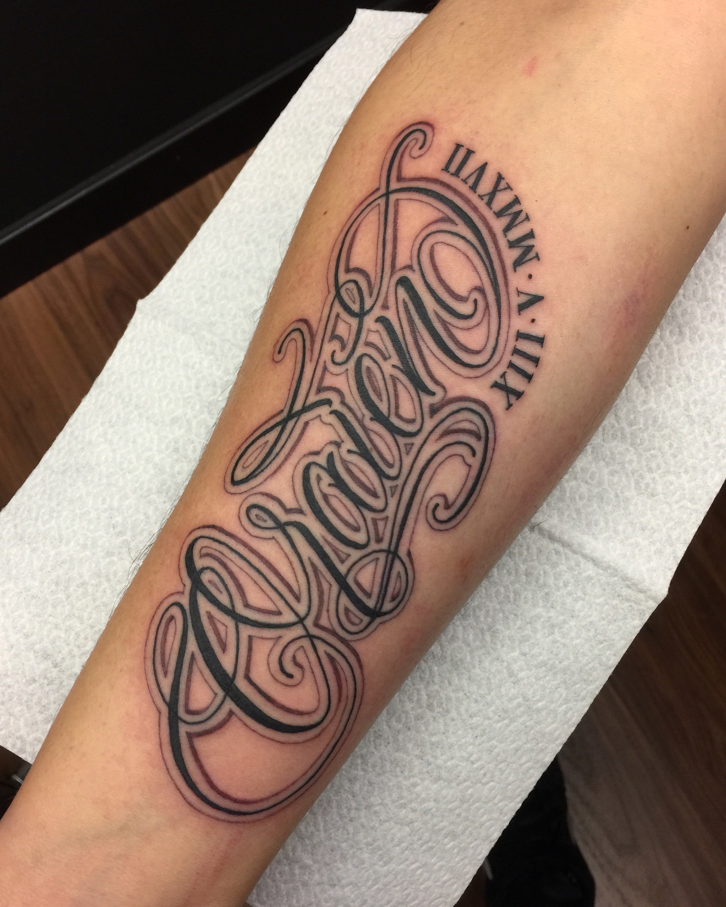
Script works best when it follows the shape of the body. A word that curves with a forearm, sits across a chest or wraps along a collarbone looks like it belongs there. Squeezing lettering into a spot that doesn't suit it tends to look like a sticker. We'll always look at placement together before anything gets tattooed.
Skip the font menu
A lot of people come in with a font they've found online, and that's fine as a starting point. But hand-drawn lettering almost always looks better. It can be shaped to fit the placement, the spacing can be tweaked letter by letter, and it'll be one of a kind instead of something anyone could download.
I've always had a love of typography hence why I started out studying graphic design at Central Saint Martins in London. When I hand draw script I not only see the letters but I also see the space it occupies so its all about the negative space when certain letters drop or rise in a word and how the empty spaces also get filled to create a shape. That's whats important, I treat the script like an image and look for balance in its composition.
Check the spelling. Then check it again.
Sounds obvious, but always double-check names, dates and anything in a language you don't speak. I'll always go over it with you before we start, but it's worth getting right before you even send it over.
This has personally happened to me on several occasion where I have taken the customers reference and just gone off that and then asked if alls well only for them to realise they made a mistake in the beginning…. triple check hahaha
Mix it with other things
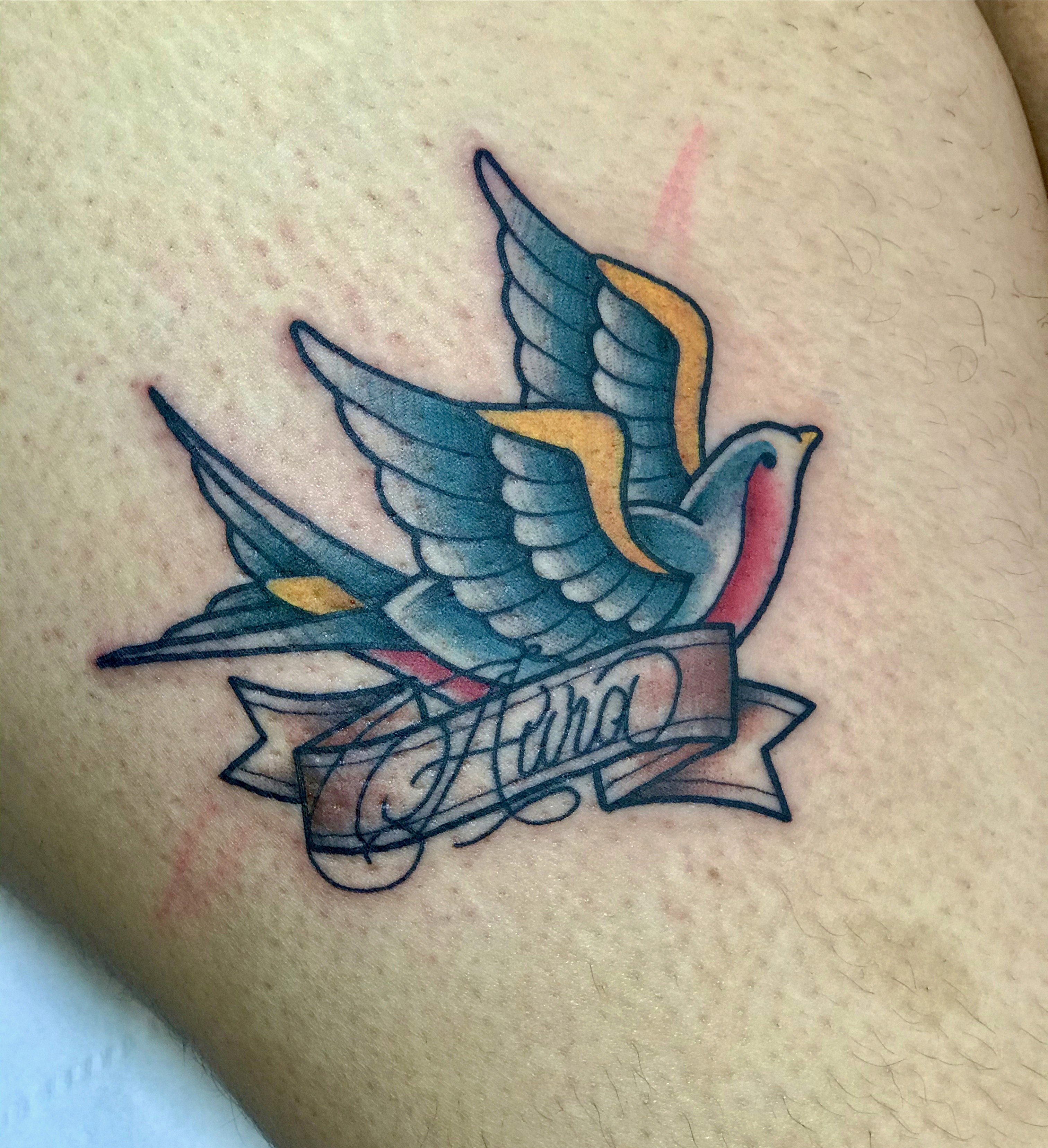
Script doesn't have to be on its own. Lettering works really well in banners, scrolls or combined with a traditional design, like a name across a heart or a word under a swallow. It's a great way to make a classic design personal to you.
If you've got some lettering in mind, fill out the enquiry form with the wording and where you're thinking of putting it, and we can start working it out together.
Script is another of my favourite things to tattoo, but it's also one of the things people put the least thought into before they come in. It's "just writing", right? Not quite. Good lettering takes a lot more than typing a word out in a nice font, and a few simple things make a massive difference to how it looks, both on the day and years down the line.
Size matters more than you think
This is the big one. Lettering that's too small or too tightly packed will blur over time as the ink settles under the skin. The gaps inside letters like "e" and "a" start to close up, and before long it's hard to read. Going a bit bigger than you first thought gives the letters room to breathe, and it'll still be readable in years to come. always listen to your artist as they will have the most knowledge as to what will work. Obviously I am always happy to try smaller to see if it can work. But at the same time if the chosen font isn't going to work small then it isn't going to work and we would discuss changing something to make it not only work but be similar and how you envisioned it.
Placement and flow
Script works best when it follows the shape of the body. A word that curves with a forearm, sits across a chest or wraps along a collarbone looks like it belongs there. Squeezing lettering into a spot that doesn't suit it tends to look like a sticker. We'll always look at placement together before anything gets tattooed.
Skip the font menu
A lot of people come in with a font they've found online, and that's fine as a starting point. But hand-drawn lettering almost always looks better. It can be shaped to fit the placement, the spacing can be tweaked letter by letter, and it'll be one of a kind instead of something anyone could download.
I've always had a love of typography hence why I started out studying graphic design at Central Saint Martins in London. When I hand draw script I not only see the letters but I also see the space it occupies so its all about the negative space when certain letters drop or rise in a word and how the empty spaces also get filled to create a shape. That's whats important, I treat the script like an image and look for balance in its composition.
Check the spelling. Then check it again.
Sounds obvious, but always double-check names, dates and anything in a language you don't speak. I'll always go over it with you before we start, but it's worth getting right before you even send it over.
This has personally happened to me on several occasion where I have taken the customers reference and just gone off that and then asked if alls well only for them to realise they made a mistake in the beginning…. triple check hahaha
Mix it with other things
Script doesn't have to be on its own. Lettering works really well in banners, scrolls or combined with a traditional design, like a name across a heart or a word under a swallow. It's a great way to make a classic design personal to you.
If you've got some lettering in mind, fill out the enquiry form with the wording and where you're thinking of putting it, and we can start working it out together.
Script is another of my favourite things to tattoo, but it's also one of the things people put the least thought into before they come in. It's "just writing", right? Not quite. Good lettering takes a lot more than typing a word out in a nice font, and a few simple things make a massive difference to how it looks, both on the day and years down the line.
Size matters more than you think
This is the big one. Lettering that's too small or too tightly packed will blur over time as the ink settles under the skin. The gaps inside letters like "e" and "a" start to close up, and before long it's hard to read. Going a bit bigger than you first thought gives the letters room to breathe, and it'll still be readable in years to come. always listen to your artist as they will have the most knowledge as to what will work. Obviously I am always happy to try smaller to see if it can work. But at the same time if the chosen font isn't going to work small then it isn't going to work and we would discuss changing something to make it not only work but be similar and how you envisioned it.
Placement and flow
Script works best when it follows the shape of the body. A word that curves with a forearm, sits across a chest or wraps along a collarbone looks like it belongs there. Squeezing lettering into a spot that doesn't suit it tends to look like a sticker. We'll always look at placement together before anything gets tattooed.
Skip the font menu
A lot of people come in with a font they've found online, and that's fine as a starting point. But hand-drawn lettering almost always looks better. It can be shaped to fit the placement, the spacing can be tweaked letter by letter, and it'll be one of a kind instead of something anyone could download.
I've always had a love of typography hence why I started out studying graphic design at Central Saint Martins in London. When I hand draw script I not only see the letters but I also see the space it occupies so its all about the negative space when certain letters drop or rise in a word and how the empty spaces also get filled to create a shape. That's whats important, I treat the script like an image and look for balance in its composition.
Check the spelling. Then check it again.
Sounds obvious, but always double-check names, dates and anything in a language you don't speak. I'll always go over it with you before we start, but it's worth getting right before you even send it over.
This has personally happened to me on several occasion where I have taken the customers reference and just gone off that and then asked if alls well only for them to realise they made a mistake in the beginning…. triple check hahaha
Mix it with other things
Script doesn't have to be on its own. Lettering works really well in banners, scrolls or combined with a traditional design, like a name across a heart or a word under a swallow. It's a great way to make a classic design personal to you.
If you've got some lettering in mind, fill out the enquiry form with the wording and where you're thinking of putting it, and we can start working it out together.